UK health labels
Health is an important aspect of life. More and more people are becoming conscious about health and their diets. Of course there are health fads coming in and out like intermittent fasting or the carnivore diet. I think however there is a consensus that what you consume in terms of nutrition values (not when, or what exactly) is the most important bit.
This leads me on to my latest obsession. Reading nutrition labels. In particular, the ones on the front of the packaging. For those not in the UK, this is what is looks like.
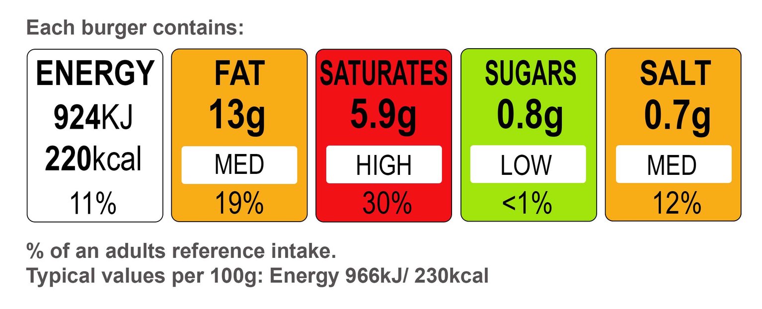
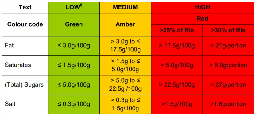
It operates with a traffic light system on 4 categories, Fat | Saturates | Sugars | Salt. Being Red/Yellow/Green is based on the daily reference intake.
This MTL(Multiple traffic light) labelling system is not mandatory, but is quite widespread on most items. The intention is that you can at a glance quickly choose healthier items simply by picking ones with most greens. Reality is, it’s not as simple.
Here’s the link to the full guidance
Deeper into the traffic light system
The table I showed raises the fact that the traffic lights are always based on 100g. Note though that the traffic lights are, but the values are not. It’s rather based on the serving size.
The intention is to give you an idea of which foods are bad quickly. You won’t eat 100g of butter in a sitting for instance so having the values based on that, does not make sense. But if you wanted to compare it against olive oil, you can easily figure that out from the traffic lights. 100g vs 100g. This does make it unfair to items that you use very little of but is unhealthy according to the traffic light system. Oils for example, you use very little of, but are clearly high in fat gets skewed against things like meat.
For better comparisons, I think reading the smaller per serving values would give a better picture. But then you will be faced with the difficultly of normalising the serving size. Different cookie brands can use same serving sizes of one cookie but have each cookie weigh differently. This makes it hard to compare as what one serving is, is purely subjective. Also, one cookie per serving is just mean! Who would stop at one.
The categories
The categories listed are also in my opinion, too simplistic. Nuts which I would say are quite healthy are almost always in the red. They are high in protein, fibre, and fats (fats). It’s missing positive categories. All it’s saying is what you shouldn’t eat. Yuka a nutrition tracking app uses the more comprhensive Nutri-Score (from EU). It includes fibre and protein as well as positive categories. There are many studies on these systems but none of them are totally conclusive which is better.
So what then?
Clearly comparing foods is hard. No one metric can determine if a type of food is healthier than others. Balance is key in a diet so straight head to head comparisons are somewhat meaningless.
Is there a tech solution somewhere here? I have no idea!